Welcome! I'm Alysa.
Hi!
Motivation

Camping with kittens in Santa Cruz was awesome.

This summer I climbed Mailbox Peak, the most difficult hike I've done yet.
My art! This is one of my favorite pieces, a painting of the artist BENEE. Read more about my art here.
Reach out!
Dr Michael Woo
August 2025 - Present
HTML CSS JavaScript Carrd Squarespace
An unforseen project
Over the summer, the father of one of my old soccer teammates reached out to me with a request. As an acupuncturist and naturopathic doctor, he needed a personal website through which clients could learn more about him, his services, and the clinic he works at. Eager for my first professional project, I took on the challenge headfirst. One of the parts I was most excited for was learning how to work with clients. I was eager to get firsthand experience in interviews to understand exactly what my client wanted, how, and when he wanted it done.
Diving in
I started by conducting an interview to understand my client’s needs. I wanted to clarify the exact purpose of the website before I began building it. We discussed everything from his preferred design, content, and layout, to where and how he wanted the site to be hosted.Once I understood his vision, I began researching. I was torn trying to decide between building the website from scratch with HTML and CSS, or starting from a template. Eventually I decided on the latter, given the simplicity of the website. I spent hours choosing which platform to use, looking through dozens of options considering features and pricing plans before narrowing down to two choices: Carrd, a single-page website builder, and Squarespace. At this point, I got an idea:
What if I build a website on both platforms, and let my client decide which he liked best?
This solution creates perfect opportunity for me to get comfortable working with different building platforms (neither of which I was familiar with), while also giving my client options to choose from.And so it began. I spent many hours building each version of the website, researching layout aesthetics, composing sample text, and customizing formatting features using HTML, CSS, and JavaScript. Once both versions were complete, I sent them to my client for feedback. I then scheduled a second meeting with him to discuss which platform to move forward with.

The Squarespace website version home page. We did not go with this option, although I liked this look a lot.
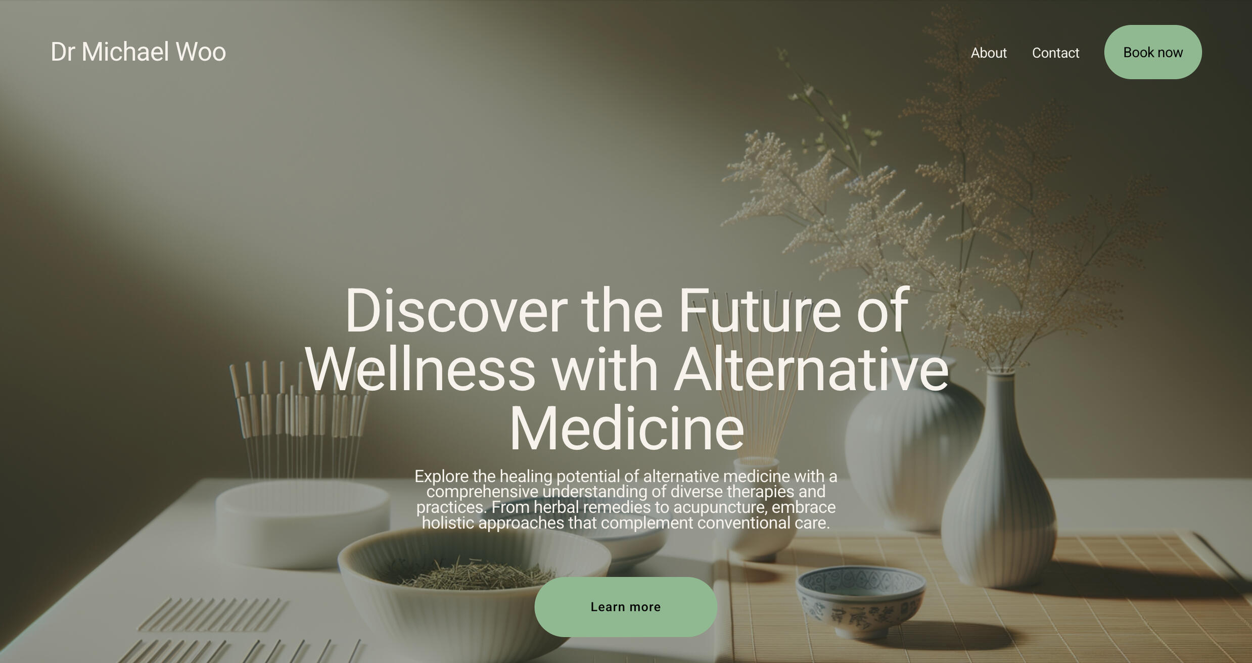
In the second meeting we walked through both websites page by page, and discussed which features he liked in both. We then pivoted to pricing. Carrd is a much cheaper platform than Squarespace, and if cost was an important factor for my client, I wanted to make sure he took that into account. After detailed discussion, Dr Woo decided to proceed with the Carrd version.Over the past weeks I have continued my communication with my client to complete this project. As you can see, the website is still a work in progress as I’m still finalizing text and image details. I plan to publish the final version in the near future.
My thoughts
I’m extremely grateful to have been asked to take on this project, as I’ve learned firsthand how to communicate and collaborate effectively with clients. I’m proud of the product I’ve created so far, and am excited to see my work make a real impact. Throughout this process, I surprised myself with the resilience and grit I showed while working through the challenges that arose. Overall, this project showed me that I’m ready to take on real-world projects and that I have the skills and knowledge to handle whatever comes my way.
MemoMate
April - June 2025
HTML CSS JavaScript React Vite Firebase Figma MUI
Your new go-to note app?
MemoMate came to life as a project in a web development class I took in spring of 2025. It was the product of a quarter-long assignment to create a mobile-first web application with any topic of your choice. Out of all the possibilities, my partner and I agreed on creating a versatile note-taking application. As college students, we know to appreciate the perks of a good note-taking alternative, which inspired us to put our best foot forward with this project.To make MemoMate stand out from the sea of alternative note-taking apps out there, we decided to add a key feature: user profiles. All notes and folders are saved to the corresponding profile, making it easy for multiple people to use the same account or for a single user to organize separate sets of notes, such as teachers managing student grades or recruiters tracking applicants.Along with that, we designed MemoMate with all other features you would expect from a standard note-taking app. Users can create, delete, sort notes and folders. Users also have the opportunity to filter notes and folders both by title and profile name, and rename them to their liking.
Diving in
Before starting, we created a prototype of our app layout in Figma, visualizing the static components that we then created with HTML and CSS. The website wasn't interactive yet, our components simply returned the document object model (DOM) content. From there, we needed to rewrite all our components using JavaScript props to present content based on the data.To make UI updates faster, more efficient, and easier to test, we built the app with React using Vite. To do this we needed to convert all static code into reusable components. My focus was on the functionality and appearance of notes and folders, making sure to convert them while also establishing a connection between notes and their corresponding folders. I used maps to sort them based on ID, so each note contained the associated folder ID, automatically adding it to the folder through which it was made. This process also helped my partner develop a similar system to associate folders and notes with specific user profiles, and for sorting notes based on keywords.To keep track of note content, I used state, with allowed them to be constantly updated, while also making them easy to create or delete. In hindsight, this implementation could be optimized, as matching notes and folders by ID involves iterating through the list on each lookup, which is not the most efficient approach.Once all DOM methods were converted to components, all components were routed to a single-page application so that app navigation could be efficiently managed. Finally, using the MUI library, a React library implementing Google's material design, I created alerts for when notes and folders are deleted.To store profile data, we used Firebase's realtime database, which saved the profile IDs, and updated the information when users edited their profiles.
My thoughts
Am I happy with how the project turned out?Yes and no.For my first website, I am very proud of the folder and note features I designed, enabling MemoMate to act like any other note-taking app. In hindsight though, I can acknowledge that there are things I would have done differently if I were starting this project now.One of the most time consuming and frustrating steps was converting all static code into React components. While I now understand why that step is necessary for someone learning the basics of web development, the process is painfully inefficient. Moving forward, I know that I will start by building components from the outset.I also admit that the CSS isn't the cleanest, and the app isn't as visually appealing as I would have liked. Considering that MemoMate was created as a mobile-first application, I wish that I'd spent more time refining the aesthetic of different screen sizes.Finally, the part I am most bummed out about is that user data isn't fully supported on the backend. While profile data is saved, notes and folders are not which leaves the project feeling unfinished. Considering these factors, as my first website I celebrate its accomplishments, and use its flaws as lessons for how I'll approach future projects differently.
District Market
April 2025 - Present
Figma
What is the District Market?
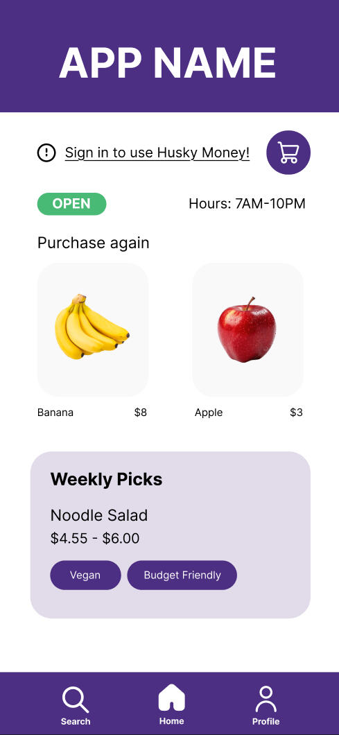
How can I improve the on-campus experience for University of Washington students? As a tired, overwhelmed, and hungry student, the answer was easy: A grocery order and delivery website! District Market is a website for UW students to easily order groceries from either campus District Market locations. Originally designed as a mobile-first website, it allows for students to place orders for pick up or delivery, favorite frequently purchased items, and track current and past orders.Inspired by a group project in which we created the original 9 page mobile prototype of the District Market website, I then created a desktop version, polishing my Figma skills in the process. The final interactive 12 page prototype is now published and available for users.
Diving in
One of the main focuses of this project was to create a more detailed, easily usable, and visually appealing version of the mobile app. By adding 3 more pages, I wanted to enhance the user experience while browsing the prototype. The main difference between the two website versions was adding 6 more food options to the browsing section and allowing users to add an item, in this case bananas, to an order and place that order. I wanted users to be able to place an order with and without the bananas, allowing them to explore more detailed UI.While designing I considered how the eye travels on the page, and whether my color choices correspond well with how users would navigate each page.

Original mobile version title page

Desktop version title page
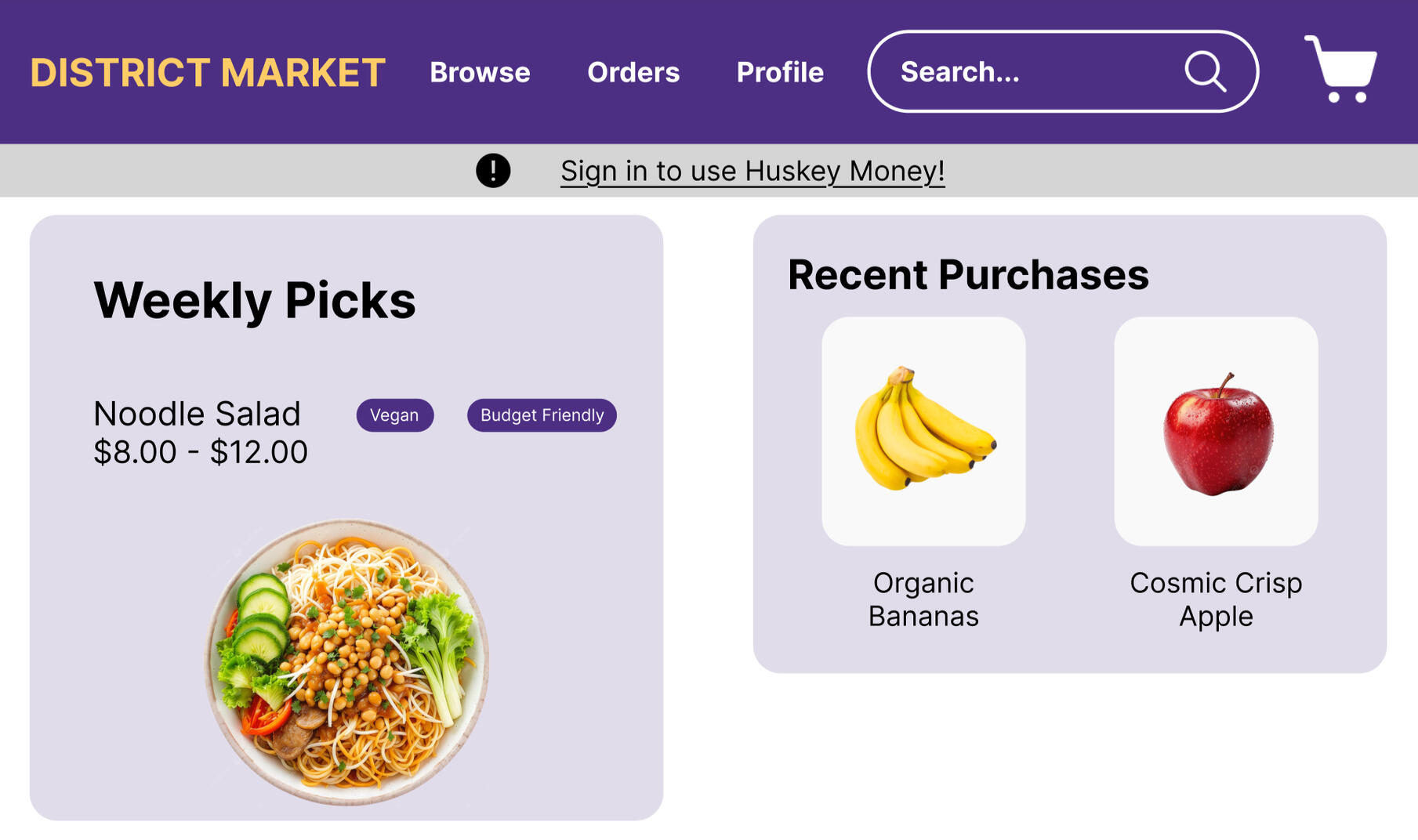
Something I wanted to change when designing the desktop version was to incorporate gold throughout the website. Keeping this in mind, I used it for navigation, marking the menu option for each open page in gold and leaving the others in white. When the cart is selected, a golden shadow hovers below it.
My thoughts
This project was created as a challenge I set myself to enhance and improve a prototype I had built as a group. It is my first solo project on Figma, one that, after hours of work, made me extremely comfortable working with the tool.As one of my first prototypes, I am extremely proud of how the website turned out, especially now that the published prototype has active users. I intend to keep updating and improving this project, and plan to eventually bring this prototype to life as a fully functional website.
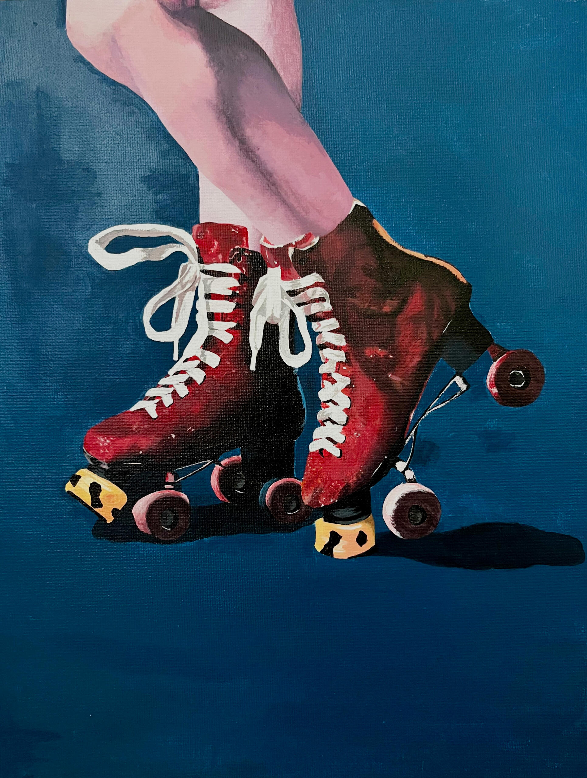
Alysa's Art Gallery
This gallery is my pride and joy. Years of artwork, countless hours of patience, heart, and hair-thin artistic precision poured into work that best expresses how I see the world.Since I could hold a pencil, I have been passionate about replicating the world around me on paper. My passion turned into a borderline obsession when I enrolled into International Community School in sixth grade, a choice school with a curriculum that heavily emphasizes visual art. While at ICS, I patiently polished my craft, learning how to work with all types of media, from pencil and paint, to clay and ink wash.When Covid shut down schools midway through eighth grade, I resorted to working with the materials I had at home. That is when I realized my love for realism. Stuck at home for months in isolation, I would spend hours drawing the world around me, learning to capture the smallest details with extreme precision. I fell in love with the patience and attention to detail that the style required. To push my creative boundaries, I turned to human anatomy as my primary source of inspiration. I was fascinated by the amount of precision it took to accurately replicate facial expressions, master human proportions, and draw clothing on the human body. For years I perfected my skill, constantly challenging myself through self portraits and models of all ages.This past year, I've broadened my horizons by shifting my focus onto animals, challenging myself to draw fur using different mediums. In the future, I plan to add other animals to my portfolio, pivoting from mammals to insects, reptiles, and marine life.
Art has always been a hobby of mine; however, I’m always open to commissions. If you’re interested in ordering a piece, feel free to contact me. Otherwise, enjoy my gallery.
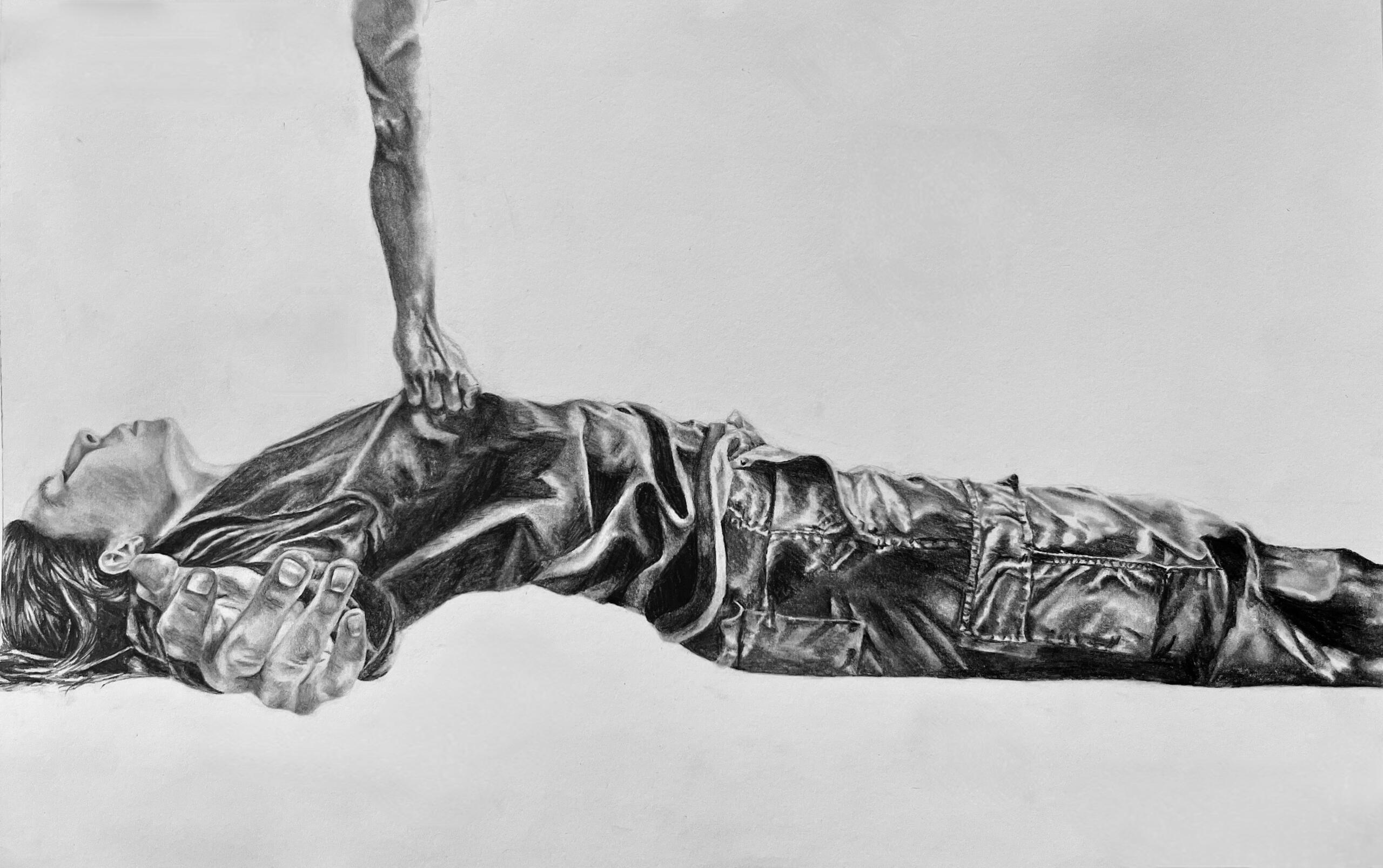
Self Portrait: Take Me Away
2023
Graphite on Paper ⋅ 13 × 18 in
Self Portrait: Take Me Away, examines the feelings of despair that come with extreme isolation. Drawn in the aftermath of the Covid-19 pandemic, the piece attempts to replicate the helplessness I felt while recovering from the psychological effects of months of being in quarantine. I depict myself surrendering to forces beyond my control, as though being physically carried away by influences I am powerless to resist.
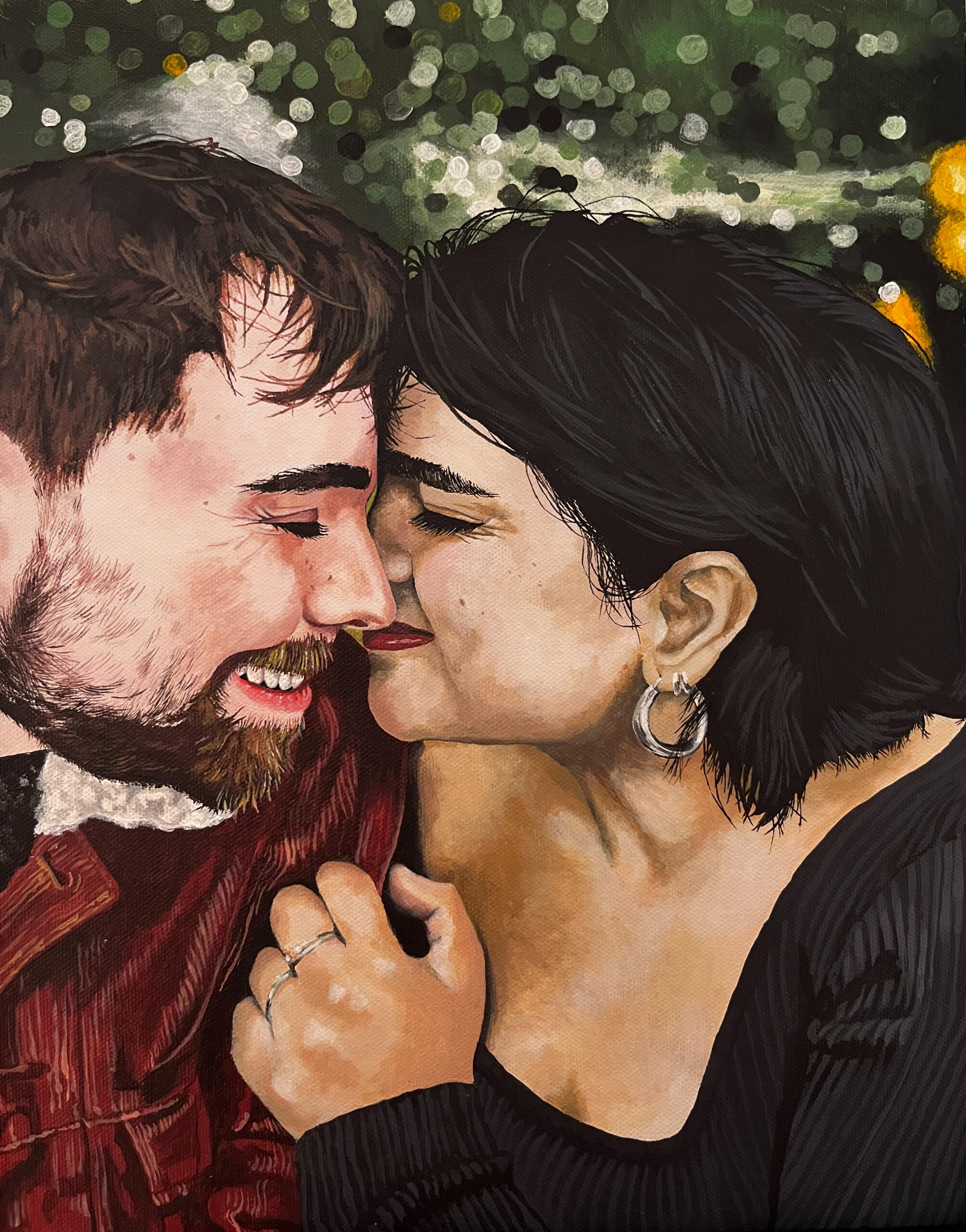
Newlyweds
2024
Acrylic on Canvas ⋅ 13 × 18 in
Newlyweds captures the quiet intensity of love between two people newly joined in marriage. Their embrace is soft, the wife's ring glinting as a delicate symbol of devotion. Every brushstroke is intentional capturing the significance of their bond, compassion, unconditional support, and tenderness. This painting took three months to complete, and is my most detailed piece ever.
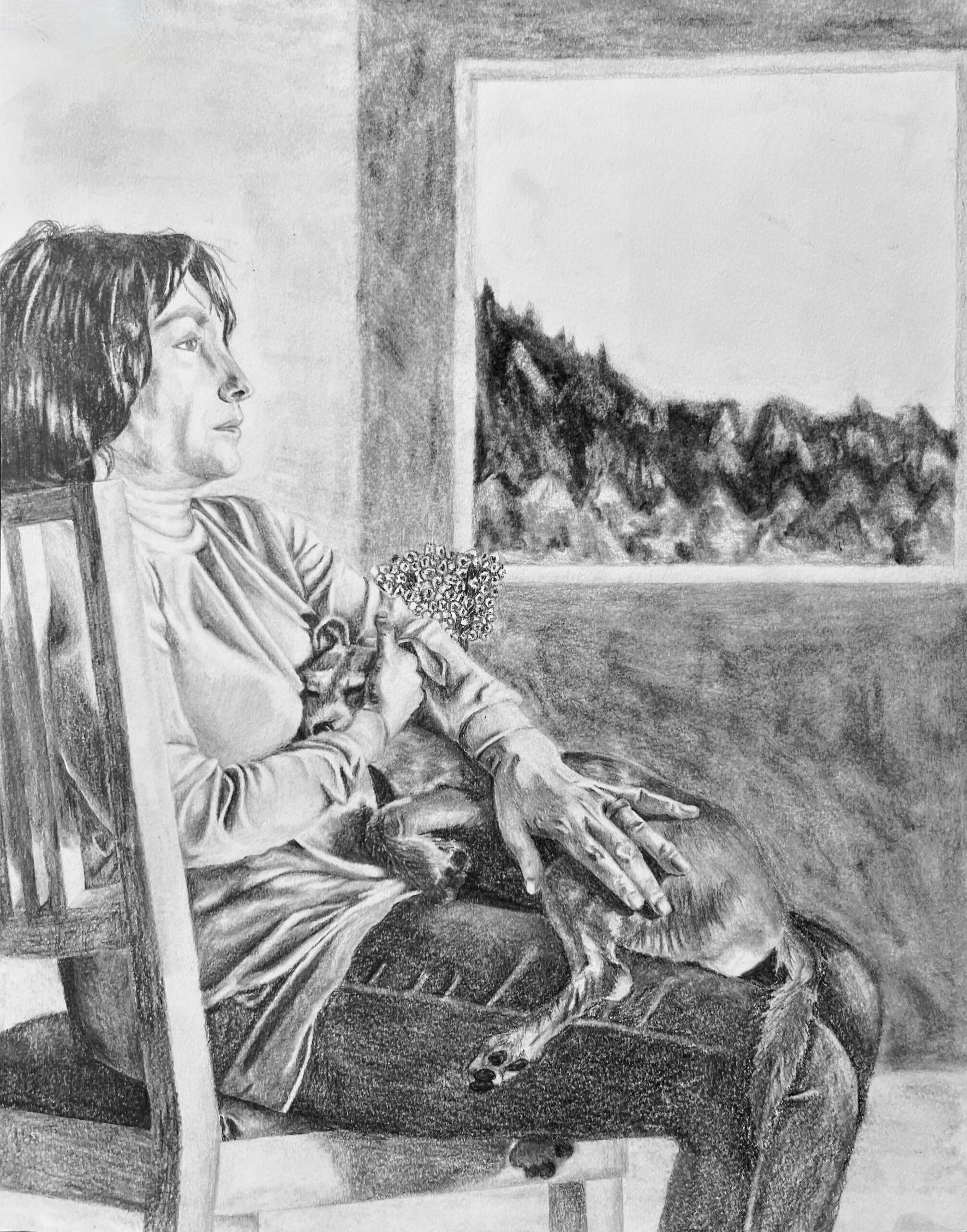
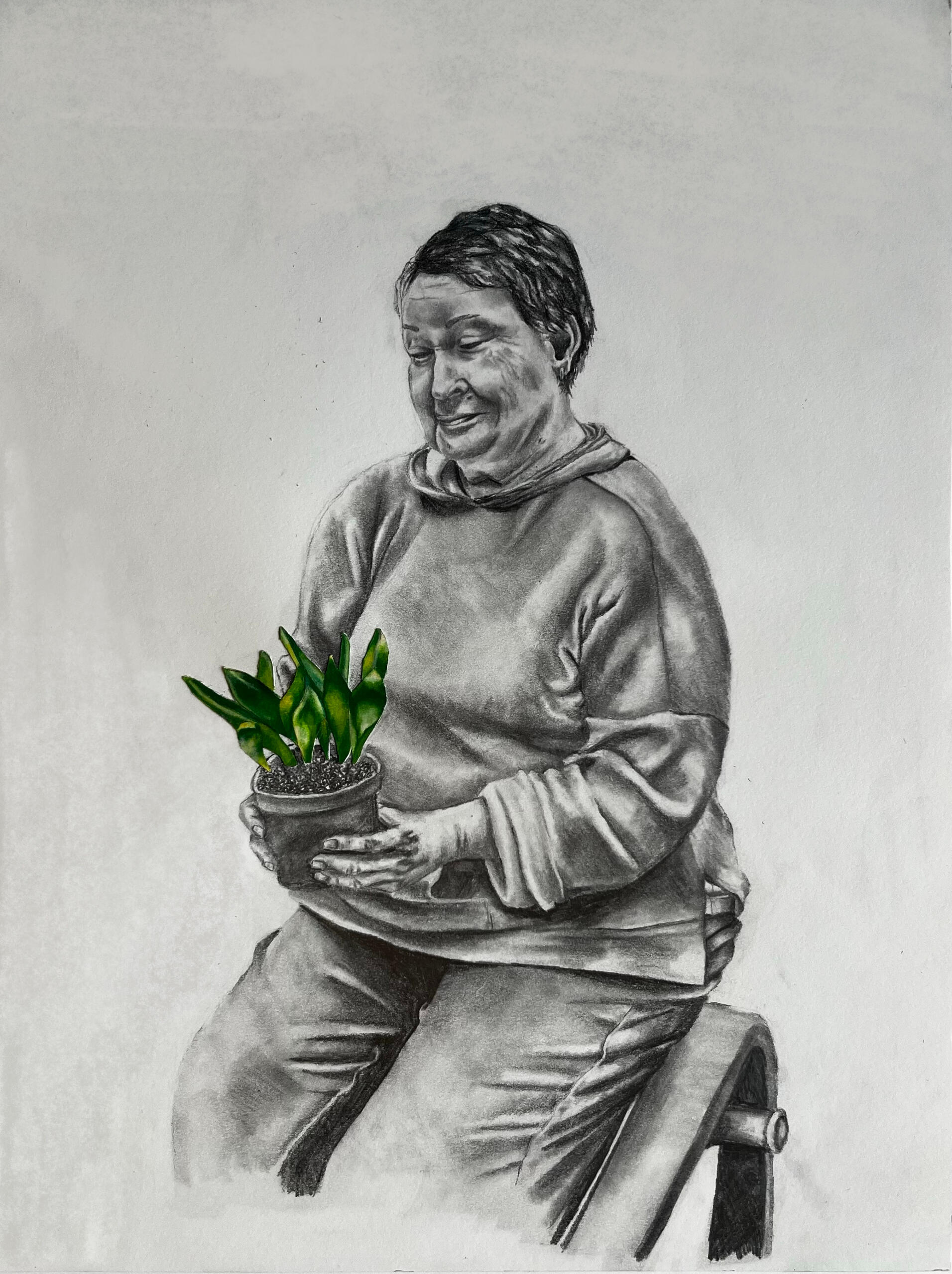
Mother and Yuca
2023
Graphite and Charcoal on Paper ⋅ 10.5 × 13.5 in
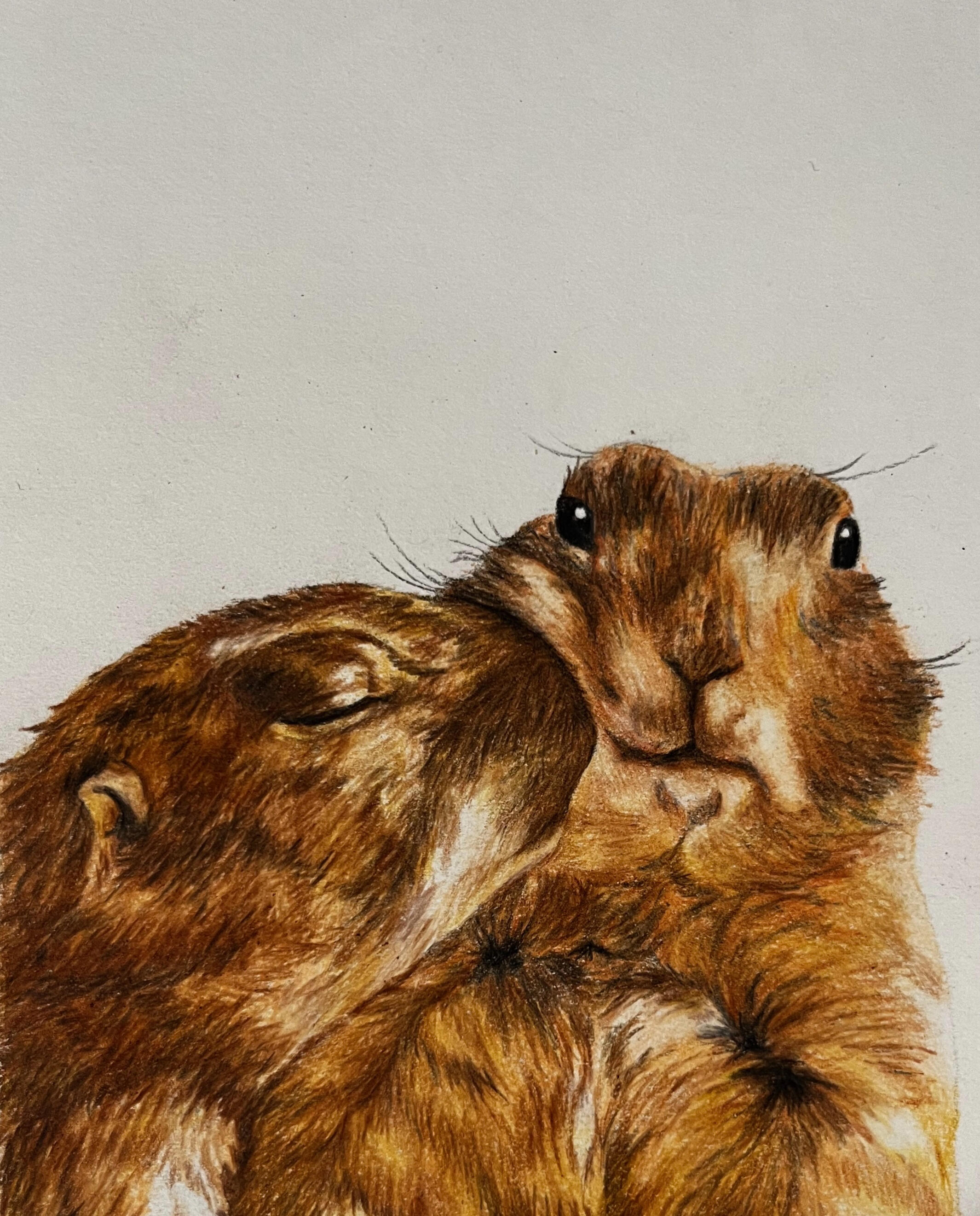
Groundhogs
2025
Colored Pencil on Paper ⋅ 7 × 10 in
For the Next Generation
2023
Acrylic on Canvas ⋅ 13 × 18 in
For the Next Generation explores the powerful bonds between generations, illuminated by the guidance of elders. The artwork uses color to symbolize the love, safety, and support that help younger people flourish. Only with help from the wiser and more experienced, will younger generations grow and bloom.

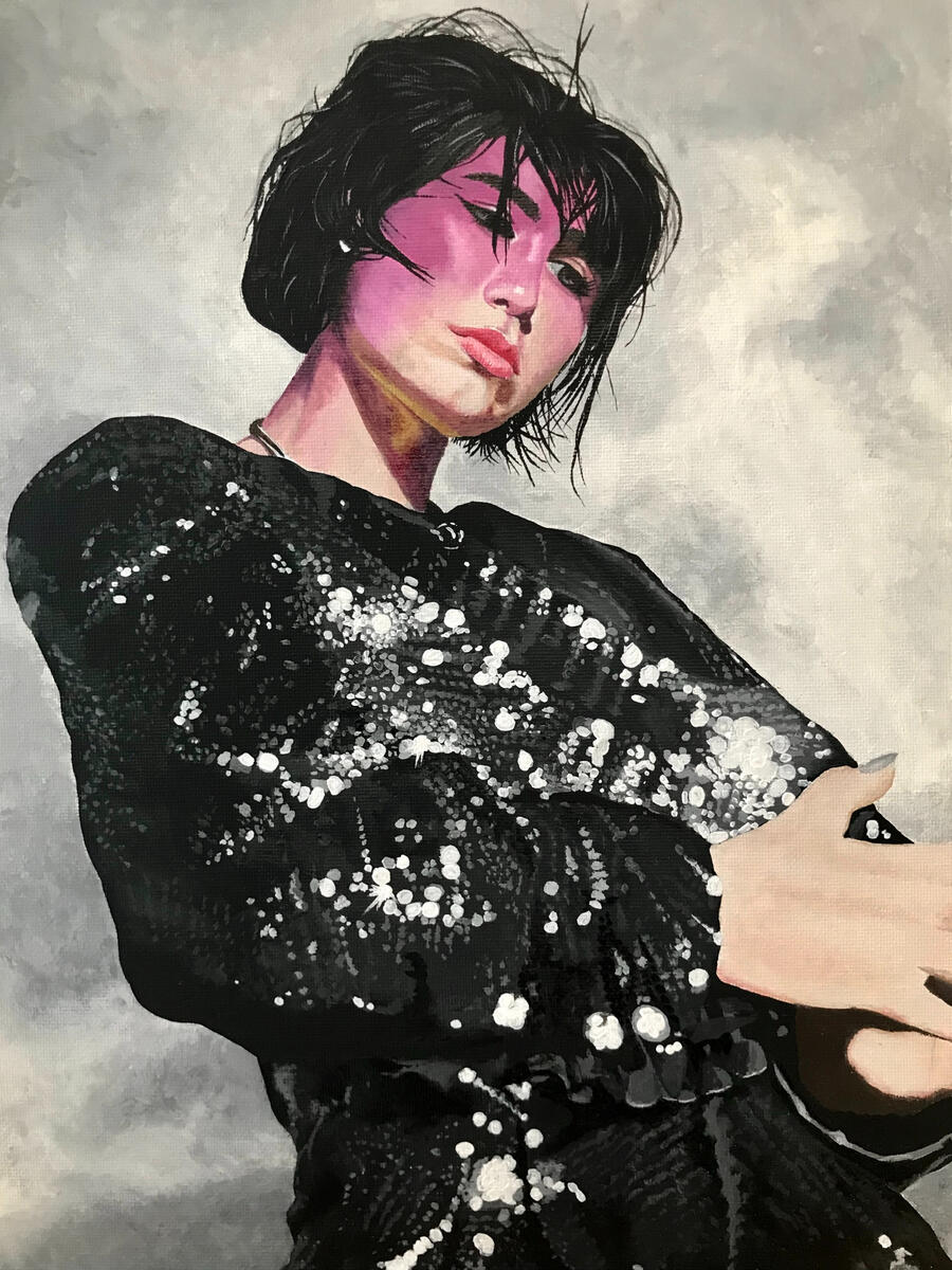
BENEE
2022
Acrylic on Canvas ⋅ 11 × 14 in
Different State of Mind
2021
Acrylic on Canvas ⋅ 12 × 16 in
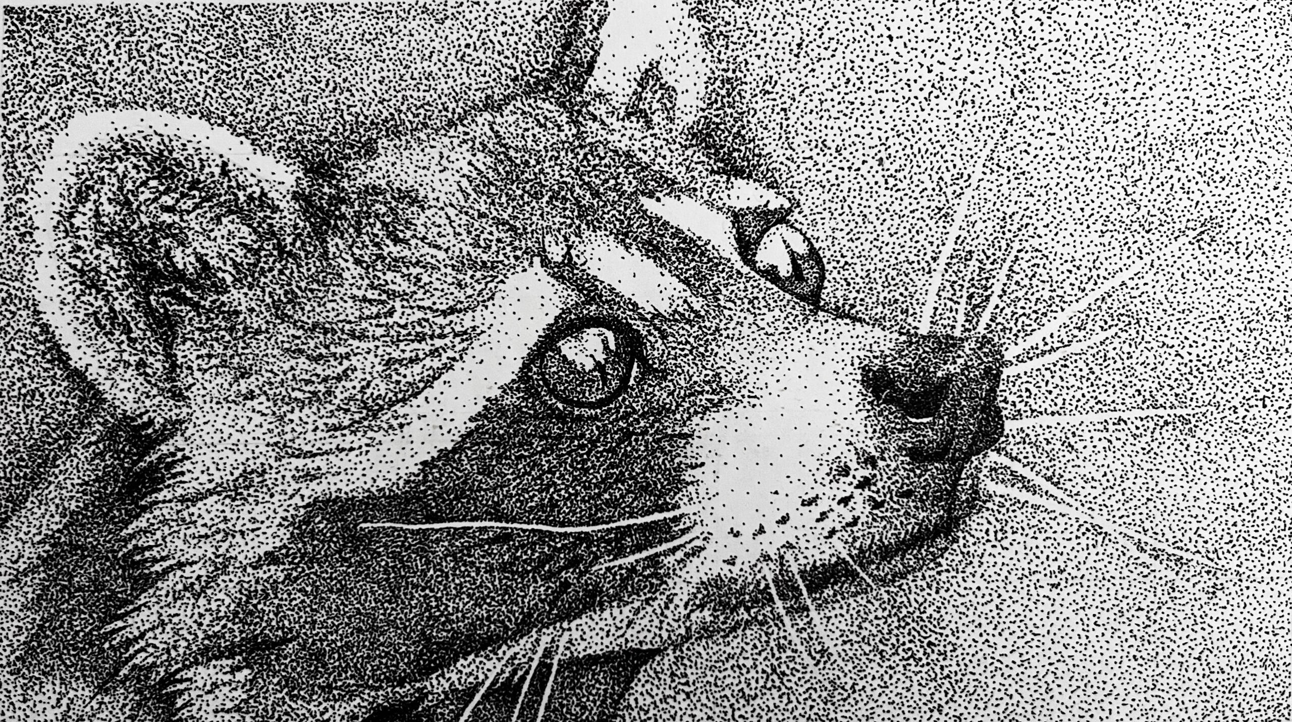
Racoon
2018
Pen on Paper ⋅ 7 × 10 in
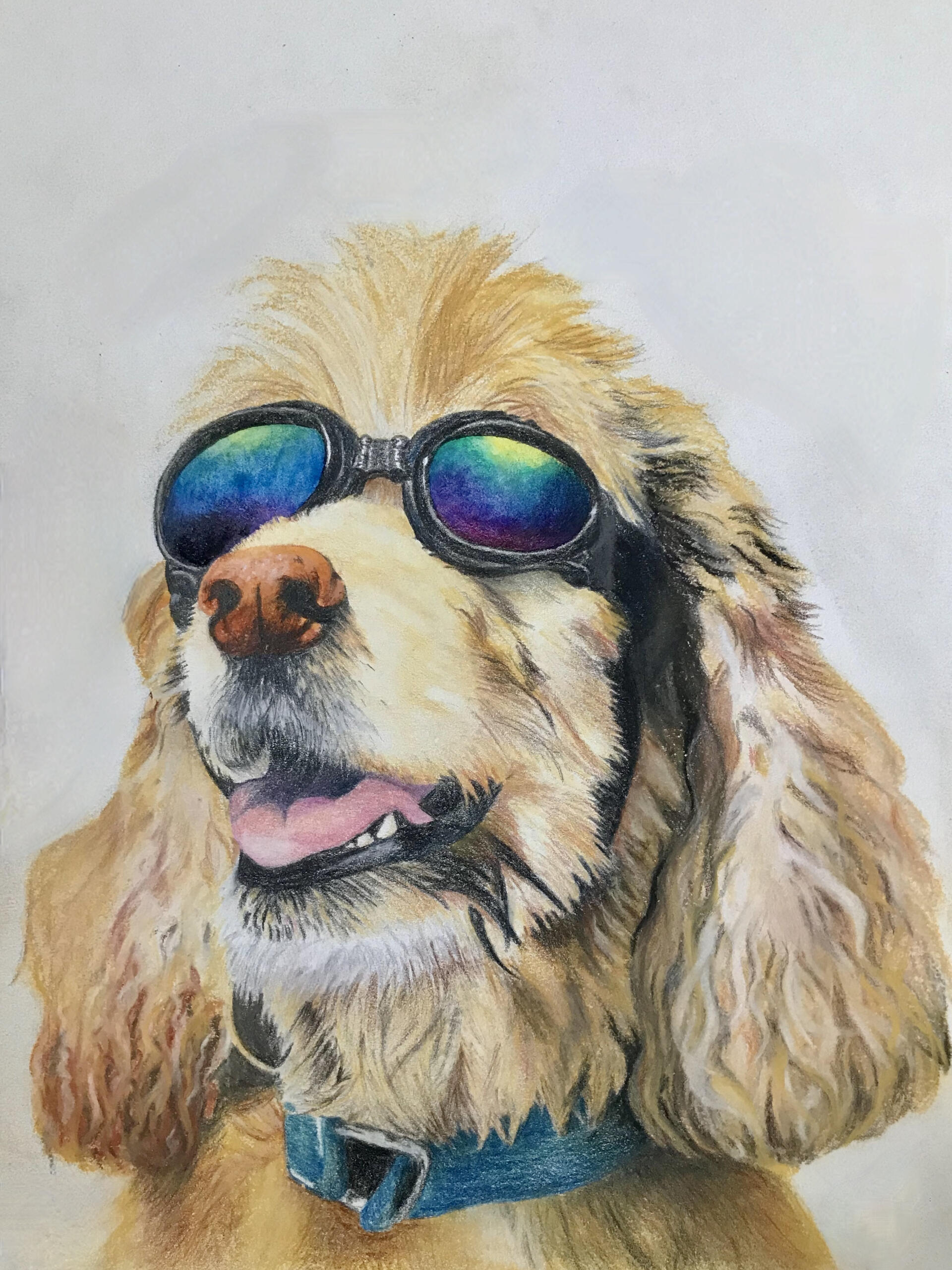
Dog with Goggles
2020
Colored Pencil and Chalk Pastel on Paper ⋅ 10 × 13 in
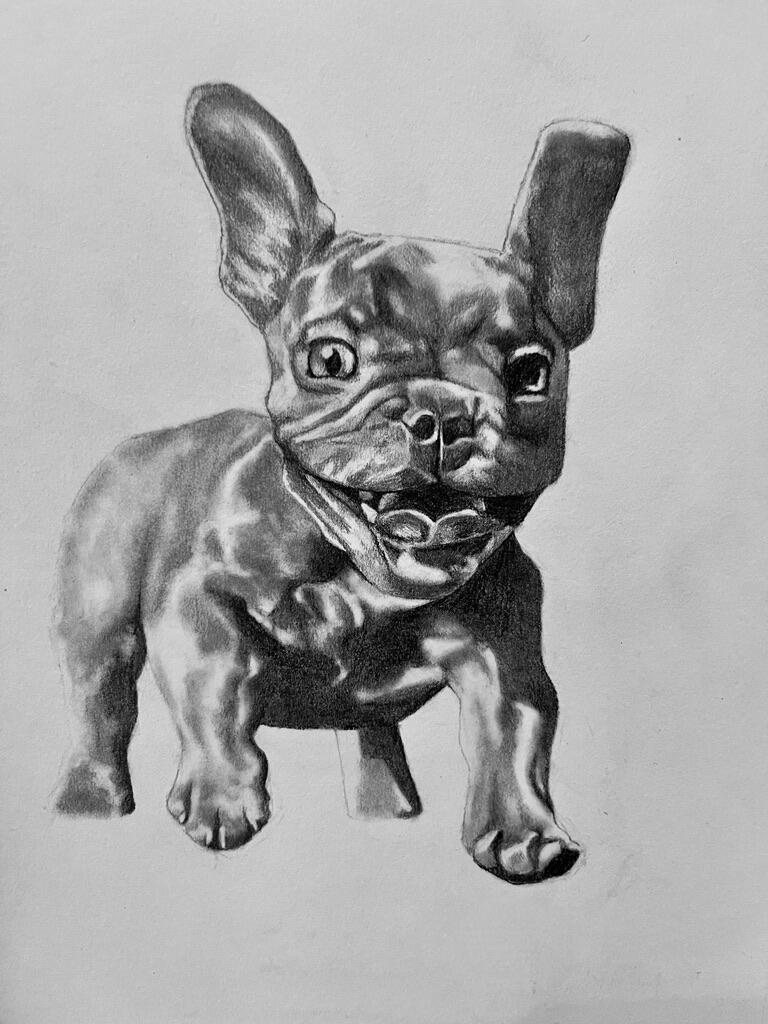
Sparky!
2024
Pencil on Paper ⋅ 8 × 12 in